This post delves into the relationship between font choices and trust, offering insights into the typography preferences of design industry professionals and the general public.
San serif versus Serif fonts as a signal of trust
First, we examined san serif and serif fonts. The results were split. Members of the design community consider modern, clean, and professional san serif font the most trustworthy. It seems the simplicity of a san serif font suggests neutrality and authority to an informed audience.�
BUSINESS INSIGHTS: Logo creation in 10-minutes for non-designers
However, the general public thought a serif font was more trustworthy, suggesting familiarity and tradition communicated truth, rather than minimalism.

The General Public trust lower case serif fonts
Uppercase versus lowercase as a signal of trust
Next, we looked at case. Again, the results were split. An authoritative, uppercase font inspired confidence in the design community, whereas the general public preferred a softer, friendlier, lowercase font as an indicator of trust.

Designers trust upper case san serif fonts
Display, slab and script fonts as a signal of trust
Next, we widened the choices to include display, script and slab type fonts. Both designers and the general public considered display, slab and script fonts lower than serif and san serif fonts, indicating that these more decorative styles are perhaps seen as and less reliable. �
Digging deeper, designers ranked display fonts higher than the general public, potentially reflecting more comfort with bold, creative styles.

Display and script fonts were less trusted by both audiences
Neither trusted or untrusted, slab fonts were ranked mid-table by both groups of respondents.�

Font weight and trust
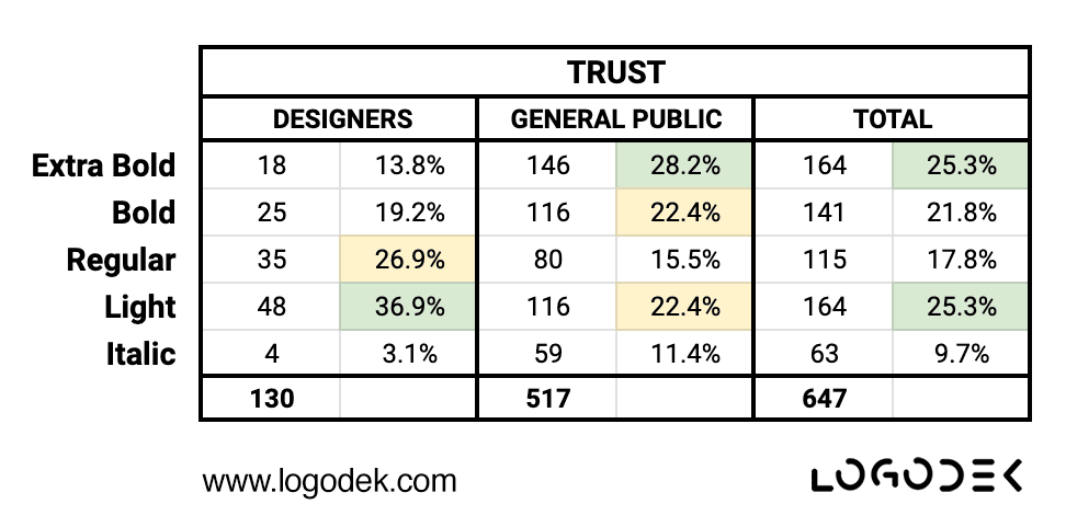
Fonts carry weight, literally and figuratively, and this was the next property we examined. The difference in opinion couldn’t be more stark. Designers considered light fonts the most trustworthy, whereas the general public went for extra bold.�

Designers trust light weight fonts
It appears less is more for designers, whereas Jo Public prefers something more substantial. �

The General Public trust heavy weight fonts
Italic fonts were less trusted by both groups.
Letter spacing and trust
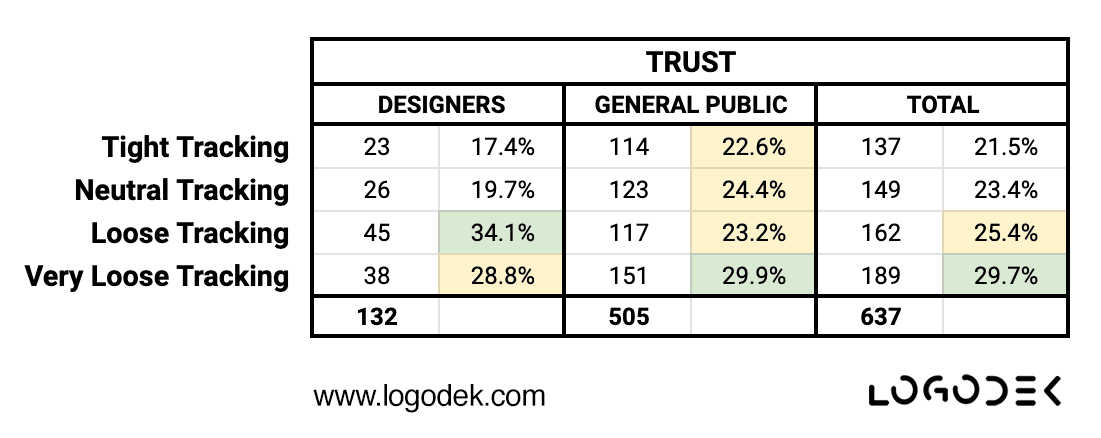
The final attribute we considered was letter spacing, specifically tracking. Tracking refers to the space between characters, increasing or decreasing the spacing between the characters affects the overall density and appearance of the text.
This property proved less divisive. Both designers and the general public found generous spacing more trustworthy than tight spacing.�

Open letter spacing is a universal indicator of trust
Conclusion
Our survey suggests there is a clear gap between the font preferences of designers and the general public when it comes to communicating trust. This contrast highlights the need to understand your audience and align design decisions accordingly.
BUSINESS INSIGHTS: Best logo colours for your small business
Perhaps not surprisingly, designers consider functionality and modernity indicators of trust, whereas for the general public, serif fonts with their sense of tradition and heritage, are more likely to suggest reliability and trustworthiness.
Playing it safe, our data suggests you won’t go too far wrong with a lowercase, mid-weight, serif wordmark. Just make sure you’re generous with the spacing and avoid italics!
Why not try our logo generator and see what you think for yourself?
